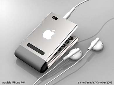
Everyone Please Stop Releasing iPhone Concept Designs
January 21, 2014 Leave a Comment
The next iPhone will not be transparent, holographic, foldable, transformable, completely flat, tiny, or giant. Sorry to disappoint.
Don’t tell that to the hundreds of designers eager to put their own stamp on the Apple brand, though. Whether it’s to show off, punk the tech news media, illustrate a wish list, or fantasize about a job in Cupertino, there’s no shortage of concept videos and images for upcoming iPhones around the web. Usually, the designers themselves (often students) are up front about not having any connection to Apple, but that doesn’t stop the pictures from spreading and being hailed as the next big thing by gullible viewers.
Throwing different ideas at existing designs can be a good way to stimulate creativity, but the results in this case just lead to unreasonable rumormongering. Don’t get me wrong: the modeling and animation is top quality, it’s just the technological predictions that are nutballs. Nor do many designs adhere to Apple’s clear track record of implementing small, incremental changes in each product generation. They’re like well-written, enjoyable fan fiction that nevertheless gets established characters’ personalities entirely wrong.
In short, nothing in this post is happening any time soon.
Transparency
Think about the small text on your phone screen. Wouldn’t it be easier to read if, instead of a solid background, you saw your fingers and the floor behind it? It wouldn’t at all, you say? Clearly you have no imagination.
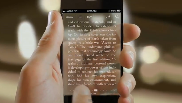
Source: Dakota Adney
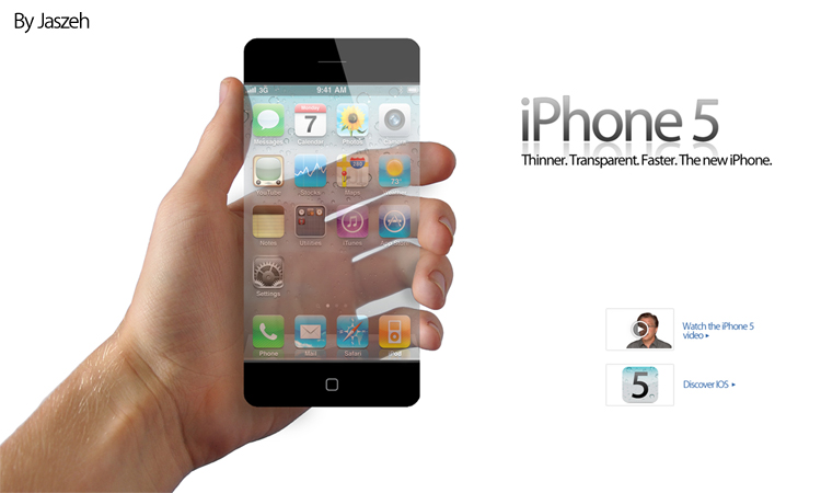
Source: Jaszeh
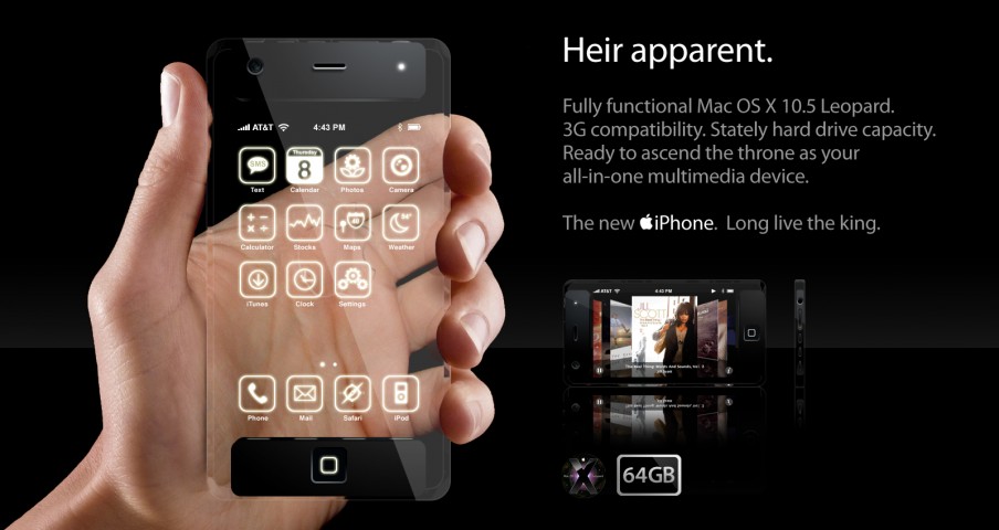
Source: Robert Davis
The last one is obviously, if you know your OS X revision history, a few years old. It was part of an iLounge concept contest, but the left side of the picture is frequently used by itself to illustrate iPhone rumor stories. Those who do so are horrible people.
Convex Screens
Smartphones with curved screens did come out last year: the Samsung Galaxy Round and LG G Flex. They’re concave, reducing reflections and conforming to the curves of the human body. A couple iPhone concepts, on the other hand, take us back to the tube TV days with convex glass. Otherwise known as smudge and glare central.
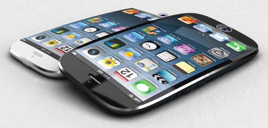
Source: Ciccarese Design
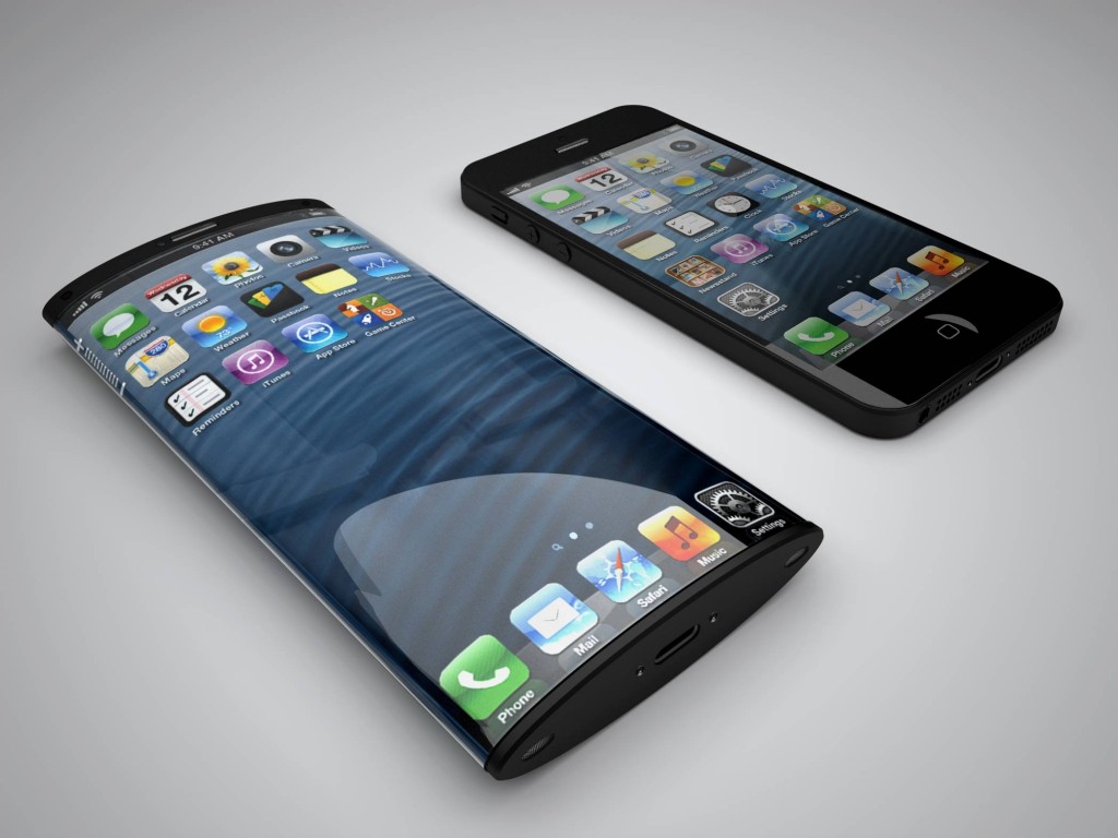
Source: Nickolay Lamm and Matteo Gianni
That second image is based on an actual Apple patent, a public document in which surely the notoriously secretive company would provide a precise illustration of a planned future design rather than a rough sketch supporting the specific technology being patented.
Magical Properties
Not “magical” as in Steve Jobs himself literally calling the iPad “magical” in front of an audience, but as in beyond the capabilities of today’s science. A headline presenting this first concept calls it “insanely thin”. It’s hard to tell how ironic the headline writer was being, because yes, anyone who thinks this level of thinness is achievable with current technology is literally out of their mind.

Source: Set Solution
It’s laying on top of an iPhone 5S, and is 3mm thick at the bottom, compared to the 5S at 7.6mm. Good luck fitting a 3.5mm headphone jack on that thing, never mind processors, circuitboards, and everything else.
Still, at least it’s not one of Soundwave‘s cassette-bots.
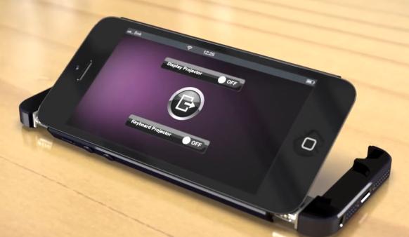
Source: FranSnk3d
A still image cannot contain the wackiness here. Placing the phone on the table makes this concept automatically transform into the gadget you see above; a pair of projectors throws a Mac OS X Lion desktop on the wall, while another pair provides a keyboard on the table. The video, from late 2012, is titled “The Secret of iPhone 5”. Virtually the same video was published six months later under the name “iPhone 6 Concept”, so this feature is just around the corner, don’tcha know.
Also? Holography.
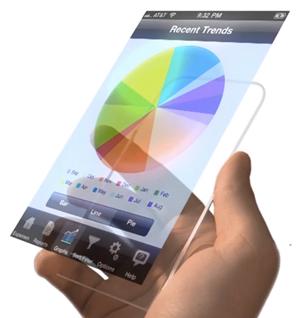
Source: Schoolpost
The creator was at least kind enough to annotate his video – titled simply “iPhone 6” – with a persistent caption assuring everyone that this clear slip of polycarbonate with the capability to levitate an enlarged user interface several inches above itself is “not real”. Thanks.
Terrible Copy
Along with the designs themselves, some designers create promotional copy. Attempts to mimic Apple’s understated yet fantastical style almost always fail. As do simple grammar and spelling.
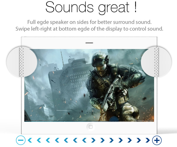
Source: Pritesh Chavan
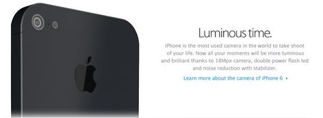
Source: adr studio
Want to “take shoot of your life”? Presumably “18Mpx” means 18 megapixels, an improbable 10-megapixel leap from all recent iPhone camera resolutions, and “led” is really the initialism LED and not the past-tense form of the verb “lead”.
Am I being unfairly critical? Probably. These artists just put their ideas out into the world; it’s not their fault that unscrupulous webmasters pair them with iPhone rumor stories, knowing that sensational images will draw clicks. Or that credulous page visitors don’t bother to read and spread clearly ridiculous information over social networks. Or that apparently no one has learned that the Internet does not always tell the truth.


