How to Compare Mobile Phones (to Each Other, or to Washing Machines, or … )
October 15, 2013 2 Comments
Having recently been freed from my two-year cell phone contract, I’ve been casting about for a new provider and new smartphone pocket computer with incidental voice communication function. I don’t talk out of my mouth hole all that much, see, so paying for unlimited minutes seems like a waste. Even my data allowance need not be huge, as I’m usually within the loving embrace of a familiar WiFi signal.
My money is best spent, then, on a powerhouse of a device, with plenty of processing speed and memory and fancy features. I prefer Android; a good camera is a must; and it must be small enough to fit into the side pocket of all the carpenter jeans in which I’ve invested. And because I don’t want another contract, an “unlocked” phone compatible with my chosen network is essential.
To compare smartphones, a bevy of websites are available, each with their own positive and negative aspects. Of course there are your favorite shopping sites and price comparison engines, but they tend to have a bias toward the same phones available at the major carriers’ own sites. For unlocked phones, specialty sites are the place to go.
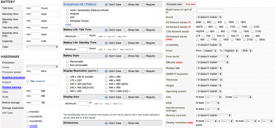
Depending on your level of patience with tickboxes and dropdown menus, WhistleOut, PhoneScoop, PhoneArena, or GSMArena should point you toward reasonable candidates. WhistleOut and PhoneScoop let you compare the copious details of five phones side by side; PhoneArena is limited to three. GSMArena does have a compare feature, but not accessible directly from the results of your search and only for two phones at a time.
If you just want to pick from prominent phones, Geekaphone is your prettiest option. With giant pictures, room for five models, and a few benchmarks expressed in graph form, it’s almost fit for posterization. On the other hand, Compare Cell Phones spells out the advantages of each of two models in a compact list.
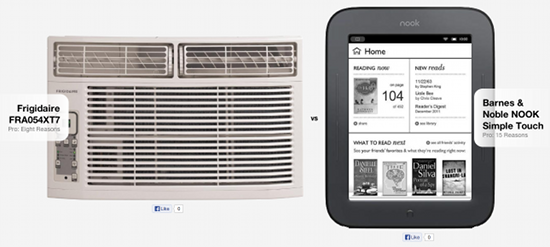
The real masterpiece, however, is Versus. Like Compare Cell Phones, it provides superior aspects for each of two devices – and not limited to just cell phones. It mostly focuses on consumer electronics (cameras, game consoles, televisions, etc.) with some appliances like washing machines thrown in, but also includes cities. And mad, brilliant genius that it is, Versus allows cross-category comparisons. How else would I learn that the Roomba 660 vacuum cleaner is better than the Xbox One because it’s 3mm narrower and “Doesn’t get stuck”, to say nothing of the dirt and anti-fall sensors? Then again, the Roomba has no HDMI port nor Blu-ray capability.

How could Barnes & Noble neglect to include a bacteria filter on its flagship e-reader?
Although, admittedly, the form factor is much more attractive.
The only thing holding Versus back – and yet making it even more entertaining – is the quality control on its information. In the perennial (yet largely one-sided) rivalry between Boston and New York, for example, I’d be surprised if only 17.03 percent of the Big Apple’s residents used Facebook, and I’d be utterly astonished if 155.29 percent of Beantown’s inhabitants did so. (The higher number is the favored one in this case, subjective a decision as it may be.) Likewise, while Boston was indeed first to debut a bike-sharing system, New York does have one of its own now, and they’re even learning from each other. The site also claims that New York has public health care while Boston does not, and that New York sports five airports of unspecified type to Boston’s three with only “Wikipedia” as a source.
In addition, both cities get a point in their favor just for having a gender ratio. Both lean slightly female, but New York’s 52.51 percent proportion is greater than Boston’s 50.8 percent. In Versus’s words, “There’s an oversupply of female population which can be good for single men.” Nice, objectification and heteronormativity. The opposite is said of Boston, with its 49.2 percent men as opposed to New York’s 47.49 percent. Versus also awards wins for higher population (but lower population density), legal gambling, a greater number of international headquarters and think tanks, and cheaper Big Macs.
Finally, I’d like to offer a hat tip to Prepaid Phone News, which was invaluable in narrowing down my cheap(ish) mobile phone service plan options. It offers basic information like coverage and price as well as arcane data like carrier radio frequencies that can turn out to be quite important when comparing phones.


